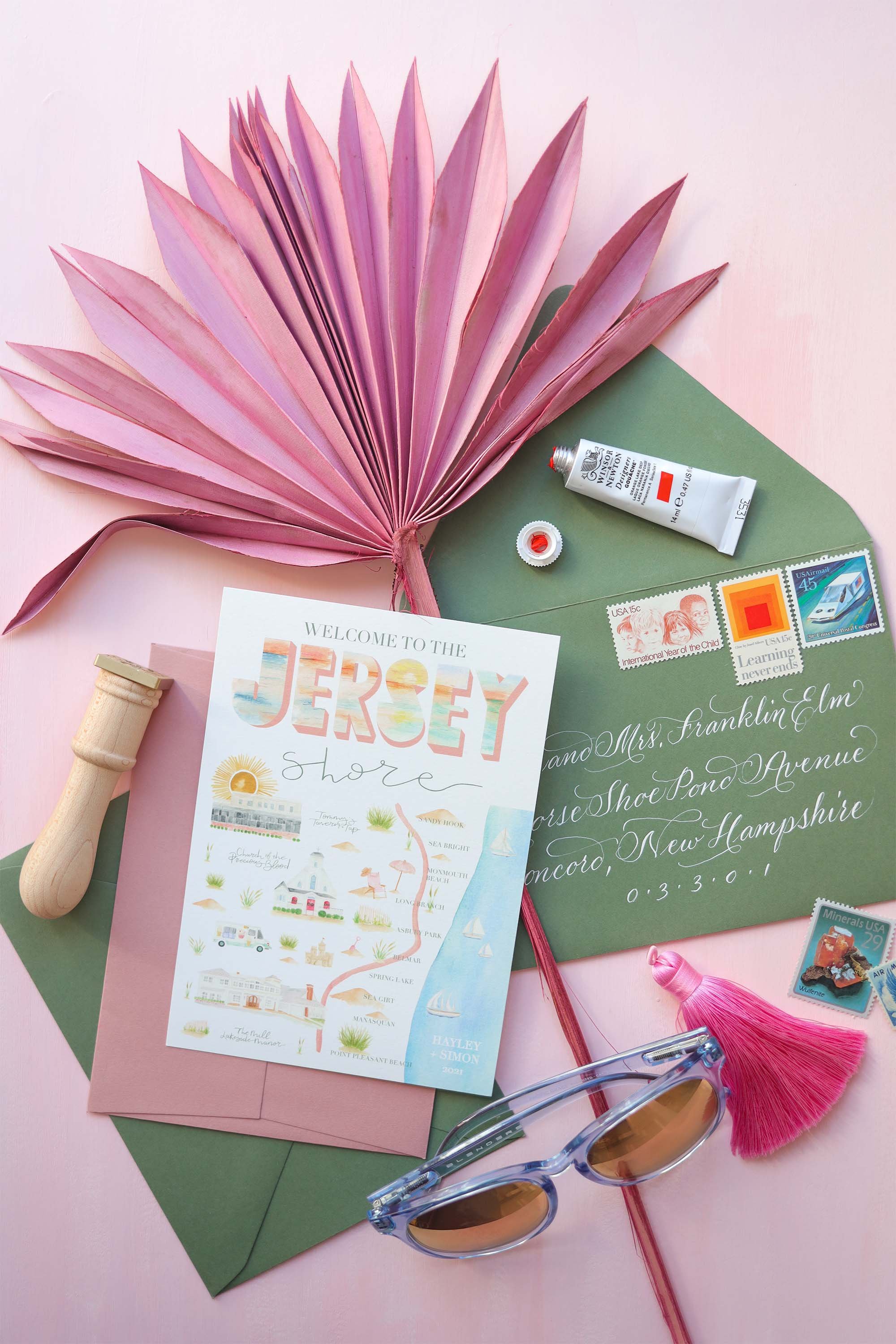
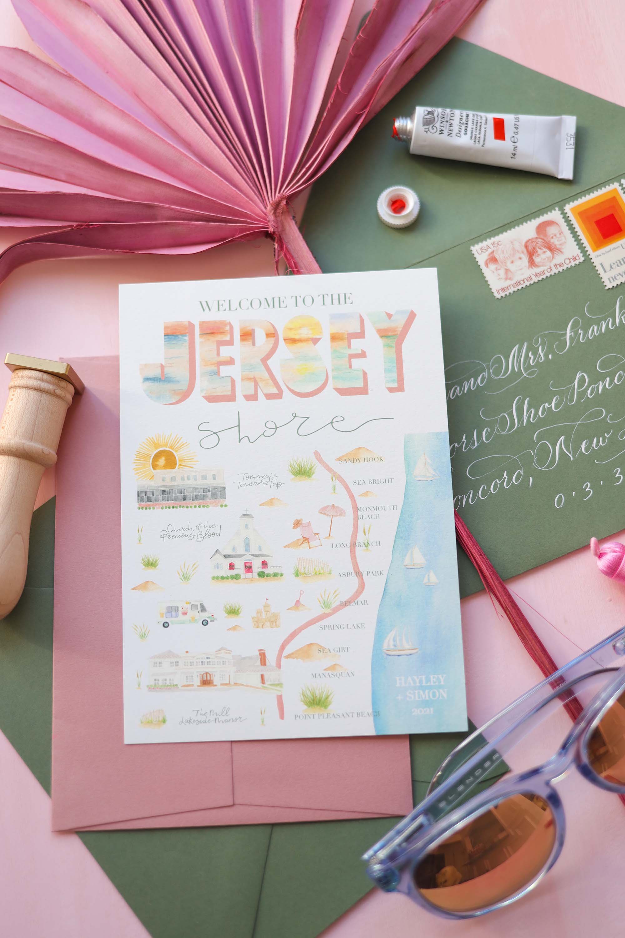
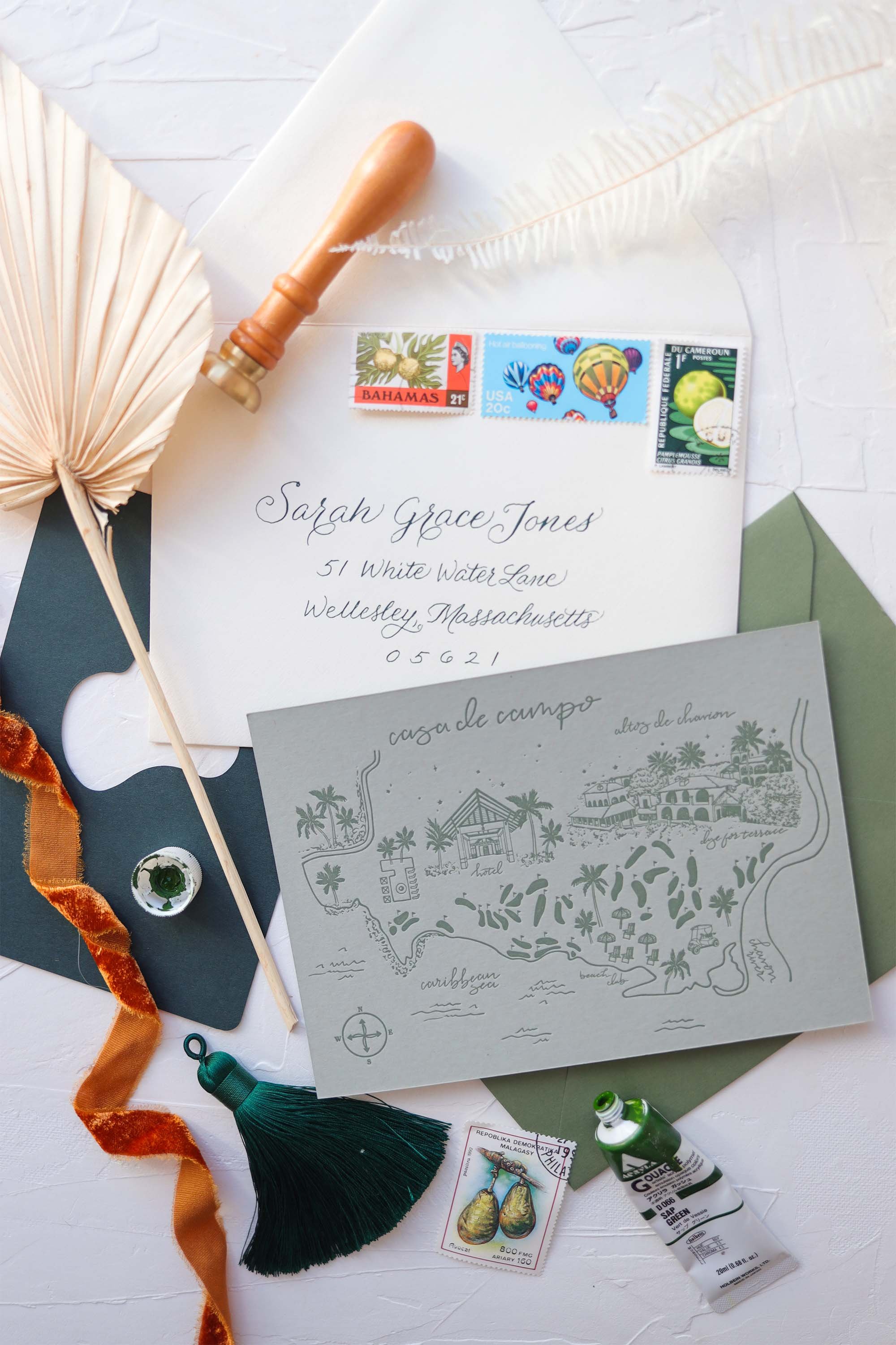
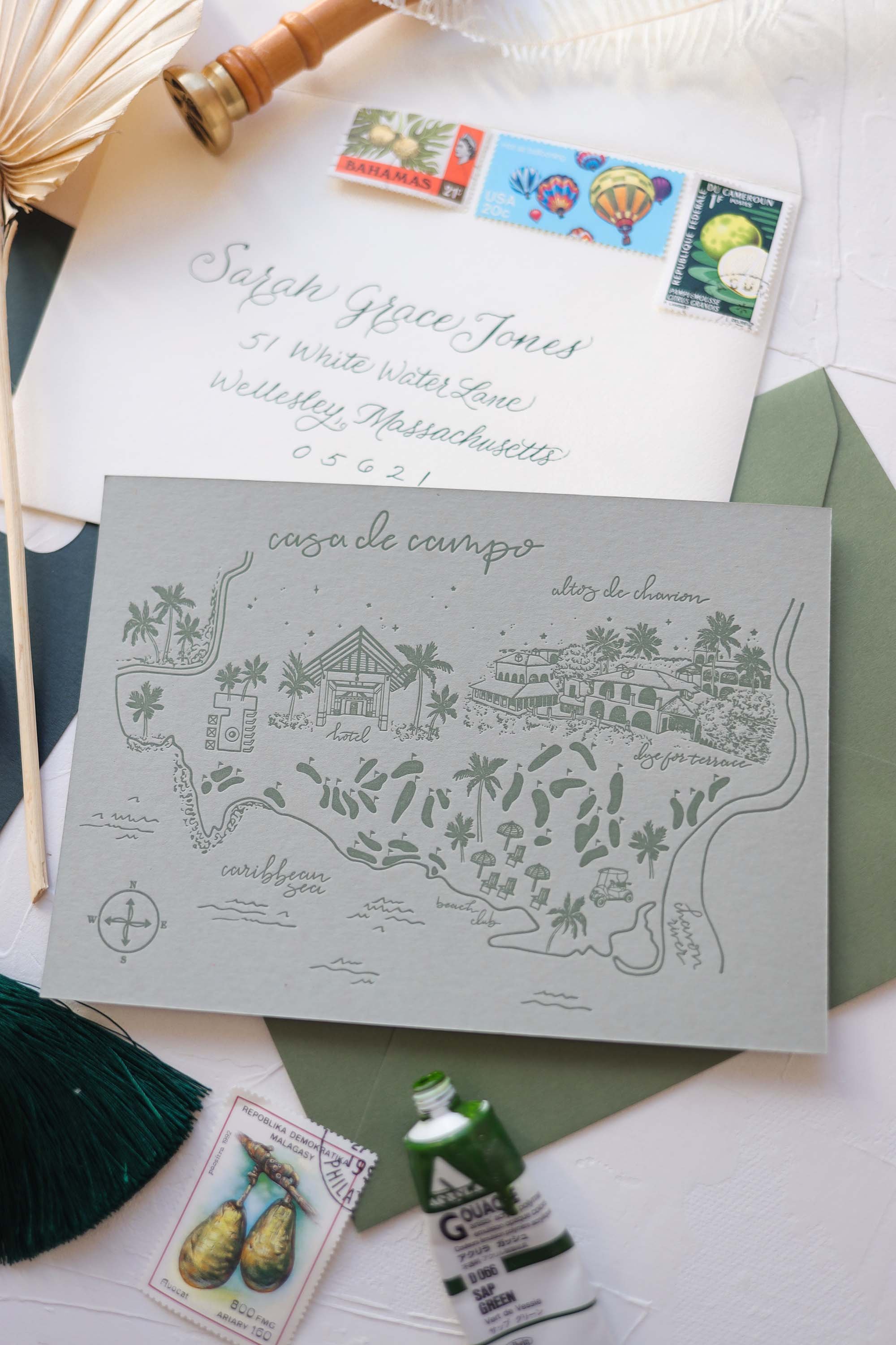
there’s more than one wedding map style?
YES that is correct. There is more than one wedding map style! Let’s chat…
Wedding stationery is full of details, needs, wants, extras, non-negotiables. And it is all really a personal decision, in my opinion. I don’t believe in “following suit” or going with traditions for a day that is literally all about you, your partner and what kind of life you lead and will continue to lead together as you grow in your marriage. If there is a tradition that holds meaning to you, go for it! If you have your own idea of how best to reflect you as people through your stationery and all your wedding details for that matter, do that! I’m here to cheer you on and help you make every moment yours using paper, and other materials.
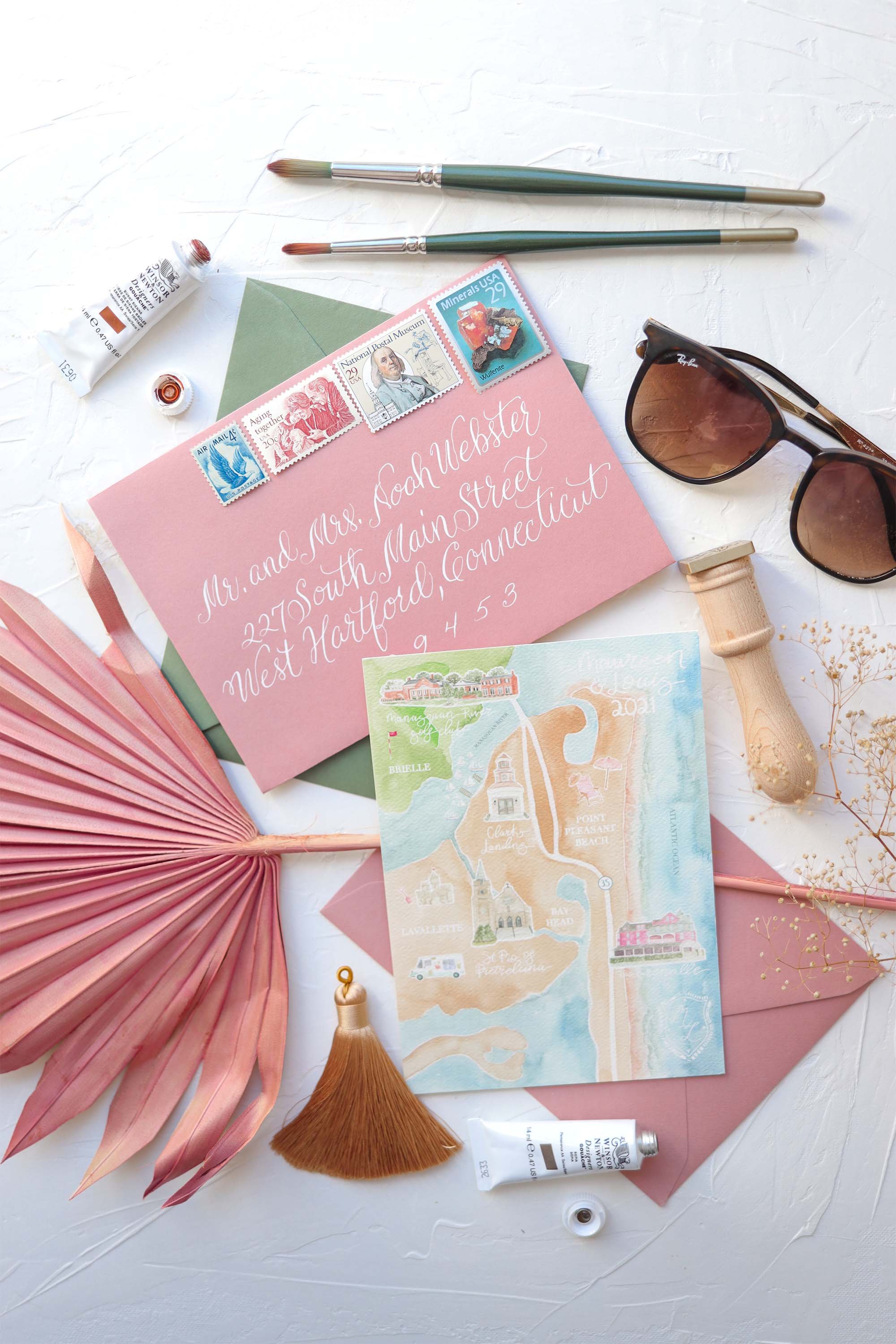
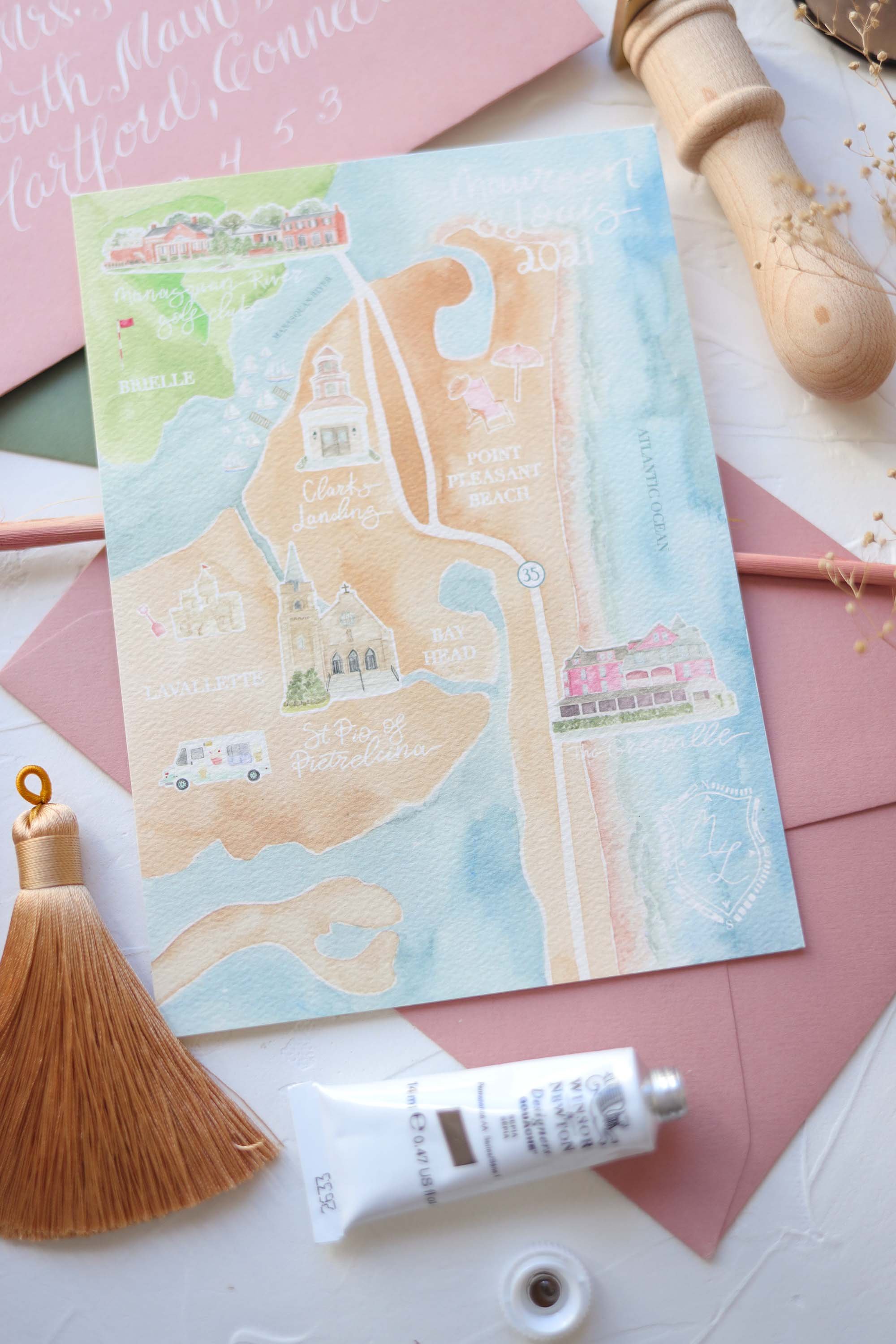
Let’s talk about wedding maps and how, there’s not just one style! There’s full coverage watercolor artwork, partially painted artwork, letterpress or foil printed line work and probably more but those are the 3 I specialize in.
Full coverage watercolor map artwork
This is your most “realistic” map design. It looks like a real live map of the area I illustrate for you. Landscape details, body of water details, whatever foliage or other natural elements coincide with the area. I will always guide you on what style I think suits your wedding stationery best!
Partially painted map artwork
This is still a realistic map design in the sense that the landmarks are placed realistically to where they actually are in real life but there’s less “ground” coverage. So instead of having the background be painted with green for grass and blue for water, there will be more white areas. This option is great when there are so many little details to include that you really want to stand out on the card. Sometimes the small details lose their importance when painted on top of the ground colors. I will always guide you on what style I think suits your wedding stationery best!
Letterpress or foil printed map artwork
This style is for the more modern, clean, sophisticated stationery suites. Maybe your wedding is more monochromatic so we’re focusing on artful details with clean lines and specific design aesthetics. I will always guide you on what style I think suits your wedding stationery best!
Part of our design process while working together is honing in on the vibes of your wedding. What kind of introduction are you looking to make to your guests? What kind of mood and energy are you amping them up for? I mean it is the biggest celebration of love after all! Let’s make it cohesive and get a reaction out of them when they open that first bit of stationery whether it be a save the date or the invitation suite. The more personal it is, the more memorable it will be!
Want to inquire about your own wedding maps? Fill out the inquiry form on my contact page!
From the top:
1st row, left and right, both photos are a examples of a “partially painted map design”
2nd row, left and right, both photos are examples of a“hand drawn line work map design”
3rd row, left and right, both photos are examines of a “full coverage painted map design”
_____
Thanks for reading!
xx Stephanie


